A Spin on Shiplap

A Spin on Shiplap

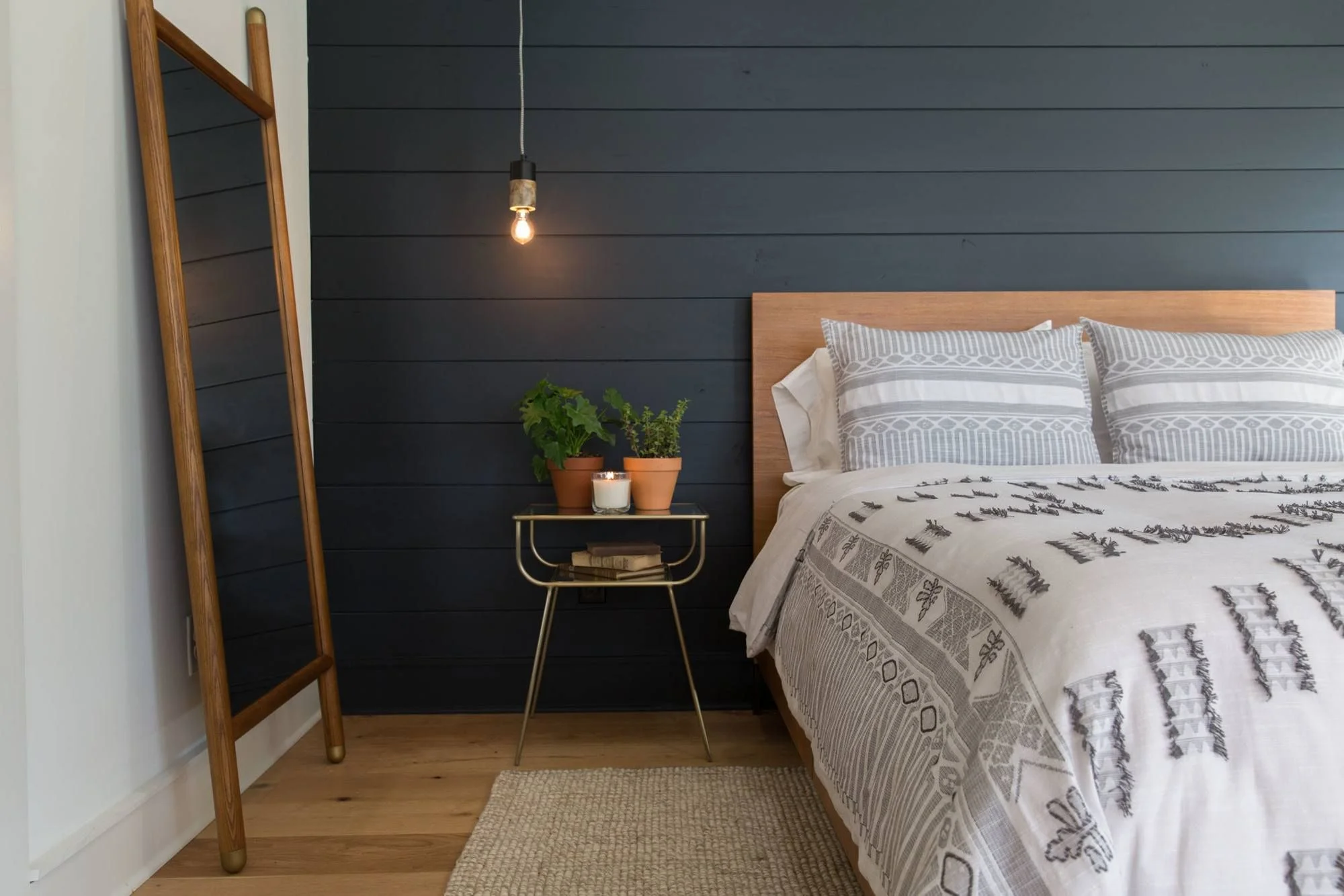
Shiplap. Do you love it or do you hate it? Did you binge watch too many episodes of Fixer Upper over the weekend (it’s okay, we did too!), that you are so over it?? Well… we are still loving it! And here’s why:

Shiplap1.PNG

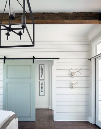
There’s so many different ways you can incorporate “shiplap” into a design! When we hear the word shiplap we immediately think of white painted wood, run horizontally on the wall, like the pictured here in this master bedroom. Now don’t get me wrong it is beautiful and adds so much to a space.

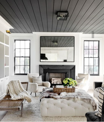
But why not change it u? Just by simply adding a coat of paint you can transform the style of your space. They used a dark gray shiplap on the ceiling here in this contemporary family room and it is stunning! it not only draws your eye up but it adds so much character. The dark grey is such a nice contract against stark white walls and furnishings.

shiplap2.PNG
shiplap4.PNG

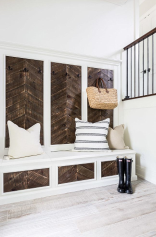
Or why not tr turning the wood on a diagonal like we did here in the this dining room that we are loving! The texture and color of the white discs against the light gray shiplap walls creates such a focal point in this space. You can also use shiplap on a smaller scale, as little accents here and like they did in this super cool mudroom.

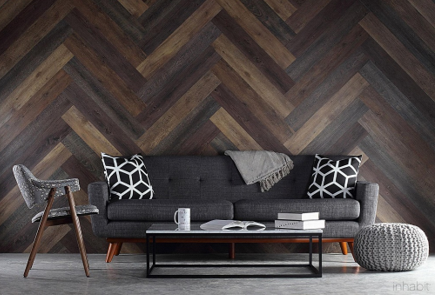
Or try herringbone pattern on a wall in a game room or kids room can be another fun way to jazz up a space. Mixing different color and textures of wood can instantly change the overall feel by adding warmth and dimension to a room.

shiplap5.PNG

Tribal Southwest + Bohemian

Tribal Southwest + Bohemian

The inspiration feels southwestern, or is it modern Bohemian mixed with an eco-chic vibe?  Who cares, because it works anywhere. Do you live in the Hill Country of Texas? – it fits.  Do you live in an urban downtown loft? – it’s ideal. Do you live on acreage with a rustic farmhouse – why not?  If you are in the Southwest – well, we suggest you take a bow, because you’ve owned this look for ages.


2016 Trends: Brick Wall Accents

2016 Trends: Brick Wall Accents

A 2016 popular trend is the use of brick walls in the interior of the home. 

On a recent trip to Judge the Parade of Homes in Destin, Florida, we recognized how the different finishes on the brick can affect the mood of the space. 

Painting the brick is currently a very popular finish that will brighten the room while adding dimension and texture.  It can create a clean, modern look or a bright farm house vibe.   Keeping the brick exposed in its natural color can help achieve a warmer more rustic, traditional, or industrial feel for the space.   

We've shared a few examples on our Facebook page. 


5 Easy Ways to Update Your Floorplan

5 Easy Ways to Update Your Floorplan


1.       Lower the bar.  Lowering your Kitchen island or bar to counter height will give the kitchen a more modern, open concept feel while visually expanding the space.

2.       It’s hip to be square.  Squaring off the arched openings, countertop edges, range hoods, windows and cabinet doors will create clean, modern lines that are more popular in current home designs.

3.       Flatten the trim.  Fluted and ornate trim is a thing of the past.  Create a fresher look with flat trim, and cove molding.

4.       Polish the Railing.  There are so many stylish new options for stair railing that using round wood spindles or twist and basket metal seems antiquated.  One of the most affordable options to update your railing is to opt for the square, craftsman style railing with square newel posts.  This transitional style goes with any décor.

5.       Expand the Utility.  Buyers expect more than just a space for the washer and dryer in their utility room these days.  Design a space that is flexible, functional and creates more storage to fit the lifestyle of today’s buyers. 

Want to learn more from New Edge Design Studio? Be sure to follow us on Facebook, Twitter and Instagram!